Showing posts with label Rants. Show all posts

Surreal Email

Over the years I've had all kinds of illustrative requests. Tonight I was up late working on a deadline due tomorrow morning, and the following email showed up in my inbox:


Strange but true illustration request.

At first I thought it was spam, followed closely by my suspicion that a friend was joking around with me, and ending with the thought of "How can anyone think this is a good idea or an appropriate solution?"

Needless to say I wasn't interested in doing these illustrations (Despite the very tempting $150 budget) and turned it down with a reply email that read:

Sarah,

This project wouldn't stimulate my interest.

Thanks.

Von

Call me a creative prude I guess.

The Designers of Summer


"Hard Ball" Back print on white shirts.

Being a hired gun (creative pinch hitter if you will) means I do a lot of exploratory work that will never be used and tends to serve the purpose of helping an agency focus in on final solution. I'm not complaining, that's just the reality of the game.

Recently I was hired by Red Jacket Clothing to create a tribal tattoo themed baseball design. I love baseball, I think it has a lot of great metaphors that one can play off for all kinds of various concepts.

My client gave me full control of this project so of course I picked my favorite team, the Boston Red Sox to use in my design.


"Hard Ball" Back print on colored shirts.

I decided since this had a tribal tattoo look I'd play off of that theme with the term "Hard Ball." I also created a modular design that could be adapted for any of the MLB teams. This way the design would have a broader potential for the marketability and be relatively easy to customize by merely shifting ink and shirt colors either dark or light.

The hardest part of this design though was creating the baseball. The first one I did looked horrible. It didn't read as a baseball, it read more like a Klingon jig-saw puzzle instead. So I had to re-draw it a few times before I struck the right balance.


Logo front print on colored shirts.

The main design is a back print and this is the front center chest print. The team logo would be dropped into the middle of the tribal ring for each team.

It took roughly two months for the design to make it through MLB licensing circles and ultimately got benched. No reason was really given? But I've dealt with MLB licenses before and they are somewhat finicky IMO.

I'd be curious what others think regarding this designs marketability, so I created a simple poll you can vote in here.

Personally I like the design, it was fun to create so I'm just bummed it got put on waivers before it even had it's first at bat.

Maybe I should buy a steroid plugin for Adobe Illustrator? Hmmmm.


The Clone Wars

This past year has had it's ups and it's downs. With the economy tanking, every creative business has been effected in one way or another and mine was no exception.

But the most disturbing trends within our industry in my opinion are two fold:
1. The continued growth of the "Creative Industrial Complex" via pre-fab design, which I touched on in an earlier post this year. I'll have more to say about this specific topic in an upcoming post on my blog.

2. The exponential growth in copyright infringement. I've had a total of "62" individual cases (That I'm aware of) where designers, marketing firms, design studios, ad agencies, stock companies, and other businesses used my artwork without paying for it or seeking permission to use it.

Unfortunately I don't see this problem going away. More and more art schools are focusing on the tools rather than the creative process that facilitates original and unique ideas. Thus they are producing the next generation of copyright infringers who ironically in many cases are the same mindless drones who facilitate the degrading of our industry by pimping their ware to industrial hacks like CrowdSpring.com.

But I digress.


Google Image Search.

Showcasing my artwork online is a double edged sword. For a creative hired gun like myself you have to promote or perish. Marketing my services is a must, but it also opens me up to being exploited by unscrupulous design hacks who have no problem googling for their creative solutions.

Most of the cases I was able to handle myself by sending out a copyright infringement letter. Some are just over zealous tattoo lovers who never bothered to ask permission but still feel obligated to email me a picture so I can share in their flattering copyright infringement. This over time has spawned a rogues gallery of what I like to call "Walking Portfolios."


The Damage
I've spent roughly "73" hours responding to the "62" individuals cases. I don't charge by the hour but if I did I figured the amount of time I've invested this year alone is roughly $8,500.

Three of the cases I had to hire a copyright lawyer to deal with them. I settled two of those amicably. The third case is currently ongoing and is represented by the video below.


Chronological list of all the 2009 infringers.

- Photobucket.com User Tribal Tattoo Face Art
- Zazzle.com User Bonehead Skull Artwork
- MySpace.com User Tribal Tattoo Face Art
- Beerorkid.com Trashing Abe Art
- Deviantart.com User Tribal Tattoo Face Art
- Motattoo.com Tribal Tattoo Face Art
- Olloo.com Tribal Tattoo Face Art
- Alaskaslist.com Polar Bear Logo Art
- Deviantart.com User Tribal Tattoo Face Art
- SideHatchEntertainment.com Tickles the Evil Clown
- Chrinodesign.com Billy Mays Artwork
- VolcanoVistaHawks.com Black Hawk Artwork
- Community.mediacorp.com.sg Tickles the Evil Clown
- Flickr.com User White Tiger Art
- Flickr.com User Tribal Bat Tattoo
- Logotypes101.com Fire Giant Art
- ShutterStock.com User / Serbia Black Hawk Artwork
- Lacrosse.schigas.com Black Hawk Artwork
- Deviantart.com User Tribal Bat Tattoo
- IMVU.com User Tribal Bat Tattoo
- 895thehawk.com Black Hawk Artwork
- Dummidumbwit.wordpress.com Billy Mays Artwork
- Unconfirmedsources.com Billy Mays Artwork
- Emptees.com Tribal Bat Tattoo
- Mundozenn.com / Brazil Tribal Tattoo Face Art
- Deviantart.com User Tribal Bat Tattoo
- LAtimes.com Billy Mays Artwork
- SeemyButton.com Billy Mays Artwork
- Consumerist.com Billy Mays Artwork
- Brownsville Early College HS Scorpion Mascot Artwork
- EveryTattoo.com Tribal Tattoo Face Art
- Tao-Of-Tattoos.com Tribal Bat Tattoo
- Twitter.com User Self Portrait Illustration
- Discrim Athletic Tees Black Hawk Artwork
- Zazzle.com User Billy Mays Artwork
- Vyzion360.com Tribal Tattoo Lion
- Flickr.com User Tribal Tattoo Face Art
- Junklist.eu Two Headed Eagle Art
- JohnHaller.com Billy Mays Artwork
- Deviantart.com User Tribal Bat Tattoo
- Flickr.com User Tribal Bat Tattoo
- Picsquare.com Tiger Art
- Deviantart.com User Alien Skull Art
- Flickr.com User Tribal Bat Tattoo
- Skreened.com Billy Mays Artwork
- Gun Shop, Tacoma Espy Graphic Bird
- Photobucket.com User Black Hawk Artwork
- KosherHam.com Billy Mays Artwork
- InkedMedia.com Tribal Tattoo Skull
- MindSpark.com Billy Mays Artwork
- VectorStock.com User Doodle Fish Artwork
- case-mate.com Tribal Tattoo Face Art
- designbyhumans.com Tribal Tattoo Face Art
- (US Army) wood.army.mil White Tiger Art
- Zazzle.com User Owl Artwork
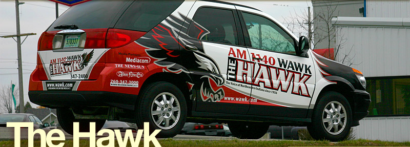
- WAWK.com Black Hawk Artwork
- Classiccitysigns.com Black Hawk Artwork
- Embroiderydesigns.com Alien Skull Art
- Flickr.com User Tribal Tattoo Face Art
- Houseofgrafix.net Billy Mays Artwork
- Uthstuph.com Security Shield Logo


"Unique" and colorful tribal pattern.

I don't enjoy getting my work ripped off and it frankly pisses me off when I have to waste my time dealing with it when it happens. That said I still try not to be a jerk with the people I'm forced to confront. I tend to give them the benefit of the doubt and try to treat the situation in a reasonable manner. If the infringer responds reasonably and works with me to resolve the matter than I can avoid taking it to next level legally.

But that isn't the case with case-mate. (Pardon the pun) I gave them three months to respond to my reasonable request regarding their infringement and use of my tribal face tattoo art on one of their products to no avail.

So as this year ends a copyright infringement lawsuit begins.

Follow Up: I've settled with case-mate. It took four months of back and forth but I was able to protect my copyright.


Blend it!

Design Time

Ever since I was a little kid and would think about the topic of time, I would make a visual connection between it and the days of the week in my mind.

I've always been a visual thinker and no one told me not to do this, it was just how my imagination made sense of the topic that far greater minds have wrestled with through out history.

When most people think of a timeline be it historical or otherwise it tends to be a horizontal linear line moving from left to right. They view if almost from a third person perspective, an observer if you will.

When I view the subject of time in my mind I see it more from a first person perspective with me in the current/now looking ahead to the next minute, hour, day, month, year etc.


How I see a week in my mind.

Even though I've pictured this concept in my head my whole life I've never bothered to share it with anyone, it just never came up and when I have thought about it I've never spent more then a few seconds analyzing it.

One day about five years ago while driving with my wife I was telling her about a cool program I watched on the string theory. During that conversation I thought about my view of time and shared it the best I could.

My wife furrowed her brow and said "Your mind is weird."


I tried doodling out what I meant but it didn't help and we started talking about something else and I once again let the topic slip back into the recesses of my subconscious.

A week in my mind starts on Monday and ends on Sunday. I think that is pretty normal. But for some reason I've always pictured Sunday being off to the left of Saturday. In other words you take a left at Saturday and arrive at Sunday. Why you ask? I have no idea. It just feels that way to me.

So in my head time marches onward forever stair stepping to the left.

( I tried to show my diagram in more of a perspective but I kept having errors with Illustrator.)

This same stair stepping format applies not just to the days in a week but also to the hours in a given day. Instead of a circular aspect for time I've always thought of it within the same visual framework as I do days in a week.

Midnight is like Saturday and so on. At this point in my post you're probably saying the same thing my wife said to me? You have to admit it's at least interesting even if you think it's a bit psycho. But if you think this is weird you should read up on the latest in Quantum Mechanics.


How I see a year in my mind.

This same structure of thinking also shapes my view of an entire year. But I'll admit this has more to do with a feeling then anything else. July and August feel like a Saturday, September feels like a Sunday and so on. And once everything is moving to the left.


The Stair Stepping of Time.

So why would I devote a blog post to this? Well, because it came up again today. I was driving somewhere with my daughter and she asked "Where are we going?" to which I replied "We'll take a left at Saturday."

When I got home today I decided to document what has been floating around in my head since childhood. The diagrams in this post represent how I see time in my own minds eye.


A new day: Someday

Have you ever wondered where the days of the week got their name? It's an interesting bit of history. I've often fantasized about creating a new day to add to the calendar.

It would fit in between Sunday and Monday and I'd call it Someday. Basically forever creating a three day weekend and serving the purpose of playing catch up on all those things you never have time to do or finish. You know what I mean. How many times have you heard someone say:

"I'll get to that someday."


Well now they could, literally.


Creating a bigger step.

I know someone will read this post, neglect to discern the sarcasm and humor and feel obligated to post a comment that this idea wouldn't work because of the lunar calendar or it would conflict with the time continuum. Regardless I welcome your feedback.

There are other aspects to this that I could expand upon and perhaps I'll get to that Someday? We'll see. ;-P


Is This Your Art?


My fish art stolen and sold on VectorStock.com

Like millions of other people the first thing I do most days is check my email. I sit down with a cup of coffee and read through my inbox early in the morning, respond to anything waiting my attention and put out any necessary fires.

My least favorite email subjects to read in the morning are ones that say:

"Is this your artwork?"


I dread opening them (But I do appreciate people point them out too), because I often find an attachment showcasing another infringement or a link to a web page that has my art displayed on it, or worse selling it.

These emails are always a double-edged sword for me. One one hand I appreciate people watching out for me, but each time always ends up taking at least an hour of my time to respond and there is no way to recoup that loss. On the other hand I've spent about a hundred hours this year alone getting to know the copyright laws in and out.

Well I got one of these emails today and it informed me that a nebulous user going by the screen name of "TuNiSaNo003" had posted my art as his own on VectorStock.com (It's now been removed)

A Growing Problem
As I write this post I have had over "50" separate cases of copyright infringement so far in 2009. I just settled a matter that happened four months ago which I had to get my copyright lawyer involved in, but thankfully most I can handle using my DMCA formatted infringement letter.

Such was the case with this most recent example of stolen art.

I really wish Google would buyout a company like Tineye.com and make it really useful with their infinite database. They could offer it much like Google Analytics and I'd even be willing to pay an annual fee to track my art.


Come on Google Spiders sniff out this post and put it in front of you acquisition board.


My original doodle wall art.

I created this art as part of a creative experiment I did a few years ago. I'm not sure if the weasel pulled the image from this post or if he got it from my corresponding tutorial?


IllustrationClass.com tutorial "Doodle Book Worm."

I'm guessing the culprit pulled this image from my tutorial on IllustrationClass.com since it has a larger jpeg in it of the same artwork?.

Either way VectorStock.com responded to my infringement letter and removed my artwork and shut down the users account in a very reasonable time I may add.

Copyright Infringement Letter
As a creative our work will exist online for the duration of our career in one way or another. So at some point you'll have to deal with those who have no scruples taking your work without permission and using it. I hope this pre-formatted letter will help you deal with the situation a lot easier.

View/Download Copyright Infringement Letter.


Graphic Homicide


Another victim of bad design.

Rarely do I talk about local design issues. But recently an article in a local news paper about a logo design demonstrated a text book case of how design can go so very wrong.

In order for you the blog reader to fully understand the context in which I'll be critiquing this design, I encourage you to go read the short article here. Or if the news paper decides to remove it you can download a PDF of the article here.


Diagraming a graphic homicide.

Design Crime Notes

Overall: This is a bad design period the end. It's not "Kinda OK" or "Not that bad" it's a victim of bad design, a graphic homicide if you will.

There isn't a distinct graphic tone for this design. It's all over the stylistic map in such an incoherent manner that it's no surprise that a board DID facilitate it.

The lack of a distinct hierarchy in the design makes for a very schizophrenic end result as well. Everything is competing for attention, which kind of reflects the board approval process it's gone through as well I suppose. Various factions all playing art director trying to get their element integrated.

I think there is too many visual compenents to begin with, but if it's mandatory to include a mountain, fish, and flowers than spend the time to weave them together in a compelling well crafted manner. What you have here is at best a mishmash design, which again may just be a reflection of the board mentality?

But the blame cannot rest on the board alone. A designer has to play a proactive roll in any creative process, not be intimidated by a client and help steer a board in the right direction. So the problem is two fold IMO. No agency, just in house designers with very little leverage and a swarm of board members who fancy themselves as art directors.

A. Photographic Elements: These glorified web graphics are unnecessary saddle bags full of bad design chops. They've been fused onto an already poorly crafted motif like love handles on a middle aged balding board member. Sure, some might find them cute, but realistically they are just visual fat that impedes the design health.

B. Typography Choice: The choice of the Optima typeface adds to the visual tension since the font itself has been referred to as a centrist font trying to merge characteristics of serif and sans serif typefaces. The fact it's hay day was in the mid 1970's makes the mark look dated from the get go.

C. Clip-Art: Like water and oil this art doesn't swim with the rest of the graphics stylistically, thus repelling each other. The so-called native american inspired graphic looks like something a hack designer would pull from an Art Explosion CD. It feels like clip-art because it's poorly illustrated and executed.

D. Mountain: At first I didn't see a mountain. I saw a green shark getting ready to eat a black fish. The saw tooth graphic is another weak attempt at native american style, and instead it adds unnecessary complexity. The rendering of the mountain is lame as well and the graphic birth mark they inserted on it's interior will just look like a hickey at smaller sizes. Brilliant!

In Closing: It's only taken this board two years to get this design result. If government can't initiate a logo design, why do we think it can run health care? (I digress.) The board needs to stop playing art director, stop using hack designers, and hire a legit agency to produce a professional solution.


The eventual eye sore.

If any board member or local citizen reads this post I challenge you to encourage our local leadership to put out an RFP to local design firms and let us show you how the creative process can produce a well crafted and creative design solution for the water tower. It won't take two years and it'll look professional.

The following is an opinion piece I wrote and submitted to the local paper in response to the water tower logo story. I hope they run it, but I won't hold my breath.

50 Miles From Good Design

What separates good design from bad design? Apparently 50 miles.

One could argue that the Pacific Northwest is a design mecca when it comes to communication arts. Portland of all cities in Oregon understands and values good design. Just drive around the city and it's hard not to see examples of it everywhere you go. Because of this attention to design Portland is globally-renowned for it's design community.

When a graphic logo is needed local Portland leaders and businesses appropriately turn to the local design community and lean on professional agencies to create what they need and the end result is creative, well crafted, and this reflects positively on Portland as a whole.

Public transportation has a nice "TriMet" logo and when Portland developed a new premiere shopping center they turned to a local design firm and produced the "Bridgeport Village" logo.

But for some reason if you travel a mere 50 miles south the attitude towards design changes and you have a city like Keizer producing the antithesis in "Keizer Station." Don't get me wrong the shopping experience is fine, I'm speaking in regard to the aesthetic of their logo, the design is bad and doesn't reflect the quality of the shopping experience.

Like Portland, the Keizer and Salem community have many talented design agencies they could be calling upon to produce well crafted and creative professional solutions for their graphic needs. Instead however Keizer chooses to create a logo design for their latest water tower graphic without tapping any local agency. You can view it here.

If you compare the quality of this water tower logo with that of Portland's "Park Smart" logo, you'll see the difference between good and bad design produced on behalf of an Oregon city. Portland values it and Keizer leadership has no clue.

Why is it that Portland design trumps Keizer design?

Portland values design, there fore they value the designers producing it and depend upon them and their agencies to guide and facilitate the creative process.

Keizer on the other hand, didn't hire any agency and instead has taken two years of board meetings and a fragmented design process to create what they now have which is at best unprofessional and at worse will reflect poorly upon the city when it's plastered on a 200 ft. water tower.

The good news is this can all be easily corrected. Keizer and Salem like Portland can have the same high standards of design appreciation and benefit from it too. It just takes leadership who'll acknowledge their own lack of understanding when it comes to the design process and realize they need to stop playing art director and be wise leaders by hiring a local design agency to give Keizer and it's community what they deserve, good design.


The Designers of Summer

I love baseball. The sport, the history, the stats and even the analogies. I played it all the time growing up and during my summers in high school me and my friends would drive up to Seattle and hang out at the Kingdome all day collecting autographs, catching balls during batting practice and of course enjoying the game. (As much as one could enjoy it, because the Mariners really sucked back then)

I also collected baseball cards growing up. I had an awesome collection with hundreds of some of the best MLB all-stars from rookie all the way through to their retirement. Unfortunately after I graduated from art school it took me eight months to get my first job, the economy like now was pretty bad and I sold my collection to get some quick cash. (I still regret that decision)

In 1997 I accepted a job at Upper Deck Company as a senior designer in their baseball division. I worked at Upper Deck for three years and it was a great experience and I made some awesome friends I still keep in contact with to this day.

I was quickly blown away by how far trading cards had come since I was a collector. In fact you'll find the highest form of print technology in the trading card industry and they're always looking for next form of print tech they can integrate into cards.

Some of the technologies I designed for were:
- Printing full-color with multiple spot colors
- Metallic Inks
- Foil Stamping
- Embossing
- Die-Cutting
- Laser Cutting
- Holographic Foil and Imagery
- Custom Packaging and Paper Engineering
- Flexography
- Embroidery


The following is a grab bag sampling of a few of the hundreds of trading cards etc. I designed at Upper Deck.


1998 UD3™ card design.

The approach I took with this set was to make the card itself look like a high tech user interface. The design integrated a multitude of print technologies and I really liked how the whole set came out.

As in every industry however they're are always critics and the trading card industry is legion with them. One guy that goes by the name of "Bull Dog" made the following comment on the above design.

"This card set has everything but the kitchen sink. I hate it."


Maybe Bull Dog was right seeing as this card is worth a whopping quarter now?


Victory™ brand logo design.

I designed several brand logos for Upper Deck while I worked there and unfortunately Victory™ is one of them. I say that because I had exactly half a day to design a brand logo and at the end of that day we were going to meet with marketing and pick a direction for this new line of product.

I had done about 3-4 designs and put them up in the conference room along with other designers concepts and than at the last moment I stuck this one up. I didn't really like it that much but thought "One more won't hurt."


Well, guess which one marketing loved. Yep, dumb move and all the other designers groaned knowing they'd have to work this beast into their designs. I got a lot of sarcastic feedback from my fellow creatives over that one and it was all well deserved too.


Victory™ brand card design.

The Victory™ brand by Upper Deck was like the Toyota Tercel of Upper Decks products. No frills, basic full-color printing and not much else. But I still tried to make the design as interesting as I could for the childhood collectors who this was targeted at. (Nevermind the hideous logo I cursed our department with)


Another Victory™ brand insert card.

When designing cards at Upper Deck we had access to a photo room that archived thousands of pictures of pro athletes. I could pull the slides and scan them for my specific design and to use in my final mechanicals. The photo guys would use my design as a guide to pick the remaining set of player photos, and production would use my digital files to set up the gang run of all the cards.


"A Piece of History" Babe Ruth bat card.

Upper Deck is the industry leader when it comes to sports collectibles, creating unique one of a kind products for very avid fans of professional sports. Not every fan can afford an original bat used by Babe Ruth however, so Upper Deck purchased one from Sotheby's and decided to share the wealth with collectors everywhere by putting pieces of the bat on trading cards.

They had me design the official branded card that would showcase this piece of history.

As much fun as this project was the absolute best part of it was being able to handle this bat myself and take a few swings with it. Knowing it was destined to be cut into pieces, I insisted we photograph it and use that image in the card design as well. One VP at Upper Deck liked my work so much he gave me one of the cards when it was finally produced.


1999 Upper Deck Encore insert card.

This image doesn't do this card justice. It has a nice rainbow foil substrate it was printed on along with silver foil stamping. This was one of my favorite insert cards I designed while working there IMO.


1999 Upper Deck Century insert card.

I was kind of like a roaming designer at Upper Deck, I'd work on MLB, NBA, NFL and in this case NHL product lines. I know nothing about hockey, but due to the popularity of the whole "Techno" vibe I had developed for the other sports we adapted it to the new set of hockey cards.


1999 Upper Deck Retro brand foil pack design.

Foil pack design was always a hit or miss form of printing. Sometimes the flexography came out nice and other times it looked like a retarded monkey printed it. This specific design worked well for flexo.


1998 Upper Deck bobblehead cards.

One friend I made at Upper Deck was a very talented lead designer named Wayne Wilcoxen. The guy is brilliant when it comes to paper engineering (Anything actually) and he figured out a production method that allowed a card to lay flat in the package but once opened could be assembled into a paper bobble head doll.

I helped in picking the photos and did all the illustrations for the various sports. If I had these growing up they would have been no-brainer bb gun targets. ;-P


1999 Upper Deck PowerDeck CD card designs.

Upper Deck has never been shy about trying new approaches to trading card collecting. These CD cards had short videos on them, audio, interactive menus, and stats. All though well intentioned this product was not very well received by the collecting community. Simply put they prefer paper products.

Now if Upper Deck could integrate a Harry Potter like interactive paper experience they may have something they could bank on.


1999 Upper Deck PowerDeck POP mobile design.

This picture makes it hard to determine the scale of this mobile but the pyramid part of it was about 14 inches square at the top. I was responsible for all the marketing pieces for this new product launch and when it bombed the marketing guy I was working with (One of the nicest marketing people I've ever worked with BTW) was fired.

It's been nearly a decade since I worked at Upper Deck but they are a client of mine now and I still create a variety of work for them and consider my former employer one of the best jobs I ever had.


To Live and Let Dieagram


Every which way but approved concept.

I've said it before, but I'll say it again, "Agency work is fickle."

Don't get me wrong, I enjoy it. It may be fickle, but it's always fun!


Circling the conceptional wagons.

A lot of agency work is exploritory. The project may never see the light of day in a real world use, but the agency in charge is exploring all graphic possibilities of what could be done.

I was hired to explore different ways a diagram graphic (think pie chart etc.) could be carried out to make it more interesting, be flexible enough so it had animation attributes, and reflect a more feminine target audience.

This post contains some of the ideas I created for this project.


Steps to no where concept.

I was provided with some very rough general directions and also asked to go beyond them as well and share what I think could work as well. Many of the ideas in this post I see animated in my mind. I was only providing static images but I think it was important to think through how they'd build out in motion as I created them as well.


This idea blossom was sprayed with creative Roundup.

Some of the ideas were pretty straight forward and probably not too practical. It's a balance of trying to be unique, but still retaining an element of graphic pragmatism. After all, there is a reason why the pie chart is used so much, it works well for it's purpose.


My personal favorite: Globulous Nodes.

How can you not like this when it's named "Globulous Nodes?" I'd animate this so when you moused over the fat ends of the nodes they would increase in size and everything else would scale back as the information populated the node end.

I've already recycled this motif into a new pattern for a bonus edition pattern set I'm creating.


A concept inspired by game show graphics.

Just search Google images for "The Dating Game" and you'll get an idea of my source of inspiration for this design.


Technicolor Rams horn concept.

The term "Technicolor" is one of those words that take a reality of life "Color" and turn it into a brand name. As far as I know reality has always been in color.


Rams horn extruded.

Follow the multi-colored brick road but watch your step, you may fall off into the alpha channel netherworld.


Animation centric concept.

Slowly spinning, transparent, pulsing, and when moused over scales up and text slides in.


Revised direction "Flat."

After taking in all my ideas the agency requests another specific direction playing off several of my ideas. Kind of like if Pantone created mag wheels I guess.


Revised direction "3D."

With the help of Google SketchUp I created this 3D version.


New Revised direction "Flat Perspective."

The agency asked me to work some of the other colors back into this new version and I also played with the perspective so it wasn't so flat as well. They also requested a version that took this same motif and extruded it into 3D. Oh yeah, they asked that I include a heart in the diagram too. (No I didn't ask why)


New Revised direction "3D" with spacing.

With all the colors and 3D applied I felt it was getting too busy. The more I looked at it the more it felt like a Fisher-Price™ version of Stonehenge.


New Revised direction "3D" without spacing.

I rendered out the detail a little more and removed the spacing which I felt added too much visual tension.

When it was all said and done the project was killed leaving me with a stink load of "Dieagrams."


Rogues' Gallery


My original tribal face tattoo art.

Over the past eight months I've been collecting a rogues' gallery of assorted people who have used my art to either get a tattoo or create a tattoo for another person. None of the people in this post sought permission to use my art and a few even posted my art within their own online accounts, listing it with their own copyright notice.

Every time I post about this topic I get a swarm of people saying "If I were you I'd be flattered!" or "You should be happy people like your work!" etc. Well let me say before I get any further that of course I'm flattered that people like my art and want to get it permanently tattooed on their body. Who wouldn't be?

That said, neither of those two comments excuse anyone from the obligation of getting permission to use another persons artwork. It's my art period the end and if they want to use it they should ask first. A handful have done this and I've worked out very fair arrangements with them and they've received flash sheets from me to assist them in getting my art tattooed with precision. The people in this post didn't do that.


Derived art by Michel Schwarz.

Michel did ask permission to use my art, but it came after he already had the tattoo done. Personally I think he should have just drawn the whole thing out himself, he obviously has the chops. But over all it came out pretty good and he was nice enough to share the picture with me.


My tribal face poorly executed on Natas Filth. (Screen Name)

Some one had emailed me a link that had the photo of the shoulder. I did some connecting the dots and found it's home on Natas. Beautiful women, but an ugly tattoo job. Too bad.


My original tribal bat tattoo art.

This design is becoming my most popular tattoo design. It's showing up all over the place like walking portfolios.


My tribal bat perched on the back of TheDeadAmongUs. (Screen Name)

Originally I thought this tattoo was used by a goth girl celebrity from Transilvania, Romania named Razor Candi? But the real persona behind the costume visual branding seems to be quite normal and answered my email informing me she doesn't have a tattoo on her back.

So I did some more poking around on Deviantart.com and discovered it is on the back of "TheDeadAmongUs" AKA Lauren. (Who apparently is a fan of "Razor Candi)

Lauren values her privacy so she doesn't reveal her last name in her profile, but she does share the fact she loves classic cars, death rock, body modification, vintage corsets, latex fashion, dermal implants, hairless cats, b-rated movies, roller derby and one could argue my tribal tattoo art as well.


My tribal bat on "Hell Ya Buddy!" (Screen Name)

I get asked all the time "How do you find these?" well usually I don't. Most often it works like this:

- Receive email saying: "Hey is this your art?" (Link provided)
- Visit link and usually see a hostage quality photo showing my art
- Shake head, groan, and say "Weasel!"
- Ask person to remove the image showing my art
- Blog about it here


My tribal bat on the leg of Helen Norcross.

OK, so my preference is shown on the left and reality is shown on the right.

If it were up to me I'd make some kind of tattoo law that only allowed well proportioned young people to get them done. Tattoos look great on beautiful bodies but not so hot on the modus operandi of the greater populace. (That includes me BTW)

I have no idea what Helen Norcross looks like? Flickr.com had all kinds of pictures of her family and husband but she always seemed to be behind the camera.


My tribal bat tickling Sherri Langfords leg.

It looks like a guy by the name of Bull Snook is claiming copyright ownership of my work. Well that is a bunch of bull! (Pun intended) And Sherri should know better being a photographer herself.

At best it's a clear case of derivative work.


My tribal bat kickin' it on the calf of Ramsey1984's. (Screen Name)

Kind of a strange location to put a horizontally oriented design? But thankfully Ramsey1984's calf muscle is as meaty as a ham hock with enough real estate to suffice. The tattoo artist seems to have done a nice precise job too, so props for that.


My tribal bat hacked together on Zoro4me3's gut. (Screen Name)

The following is another example of derivative work.

It's bad enough when people use my art without permission, but it's insult upon injury when nebulous screen names have hacked my art and produce a craptacular tattoo with it.

Of course this doesn't stop people from proudly displaying it to the world via the internet of course. So lets all hug one another and celebrate mediocrity!


My tribal bat gracing the wrist of Jakk636. (Screen Name)

Tattoos like this remind me of the old PeeChee folders everyone would doodle on in school. But in this case he chose to do it on his own body instead. So for the next 70 years or so he'll have to stare at this poorly executed art and cringe.


My tribal bat scrawled on EvilMuffinMan. (Screen Name)

Do you know the muffin man, the muffin man, the muffin man, that lives on Drury Lane, and apparently hires the blind to poorly trace my tattoo design on his back.


My original tribal lion tattoo art.

It's not just people wanting a tattoo it's also tattoo artists themselves who have no qualms about using other peoples art without permission. I know there are always exceptions and many good tattoo shops try to avoid this situation, but here is one artist who didn't.


My tribal lion on some persons body done by Pisopez. (Screen Name)

Well I've managed to figure out that the artists first name is Joel and apparently Joel is some what of a renaissance man. He's an artist who paints, plays the guitar, does tattoos (see image above) and even throws axes for fun?

Joel seems to be pretty accurate with those axes too, so I'll just say this:

"Next time axe me for permission Joel!"

VonsterTattoos.com Coming Soon
I've had so much interest in my tattoo art over the past four years I've decided to create my own official set of tattoo flash sheets that I'll be marketing through a new web presence called VonsterTattoos.com. It'll take me a good chunk of the summer to get all the art done but I hope to have it launched by Halloween at the latest.

This will give those who want to use my art for tattoos an easy way to do so legally and at a very fair and reasonable rate. If you subscribe to this sites RSS feed you'll be notified when this new site launches.